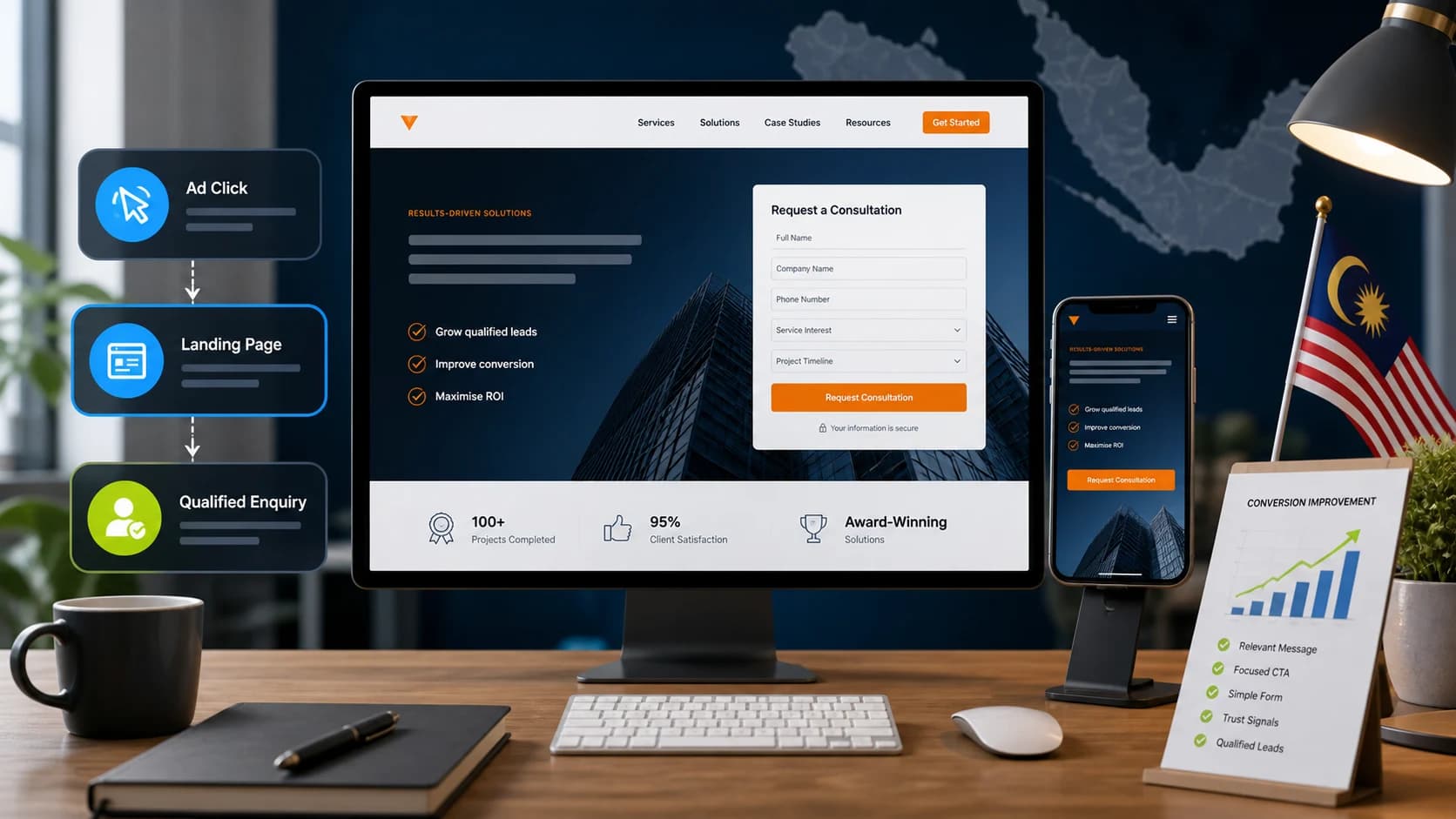
A landing page has one difficult job.
It needs to turn attention into action.
Someone has clicked an advertisement, followed a campaign link, found the business through search or arrived through another marketing channel.
Now the page needs to convince that person to:
- request a quotation
- book a consultation
- submit an enquiry
- schedule a demo
- start a WhatsApp conversation
- call the business
- register for an event
The problem is that many lead generation pages are designed like miniature homepages.
They contain several services, multiple calls to action, long company histories, numerous menus and enough options to give the visitor several reasons to leave without doing anything.
A strong landing page does the opposite.
It makes the next decision easier.
Google's own advertising guidance recommends making landing pages relevant to the advertisement and keyword, placing important information prominently, keeping navigation simple and making the desired customer action easy to complete.
For Malaysian businesses, landing-page performance deserves particular attention because the audience is highly connected. Malaysia had approximately 35.4 million internet users at the end of 2025, while 44 million cellular connections were active, with 99.3% classified as broadband-capable.
If you are paying to bring those users to a campaign page, the page should not make them work to understand what happens next.
Understanding the Cost
A simple page collecting enquiries for one local service is different from a B2B landing page that needs:
- case studies
- lead qualification
- CRM integration
- calendar booking
- analytics
- advertising conversion tracking
- multiple campaign variants
Likewise, building the page is only one part of the cost.
A complete landing-page project may involve:
Research
Understanding the customer, traffic source, competition and offer.
Copywriting
Creating the headline, supporting message, benefits, proof and CTA.
UI and UX
Structuring the page so important information appears in the right order.
Development
Building the responsive page and functionality.
Tracking
Configuring forms, calls, WhatsApp clicks or bookings as measurable conversions.
Testing
Improving the page after real campaign data becomes available.
This is why comparing two landing-page quotations purely by number of sections can be misleading.
The better question is:
What needs to happen for this page to turn campaign traffic into qualified leads?
1. Give the Landing Page One Primary Job
A homepage needs to serve many visitors.
A landing page usually does not.
Its purpose might be
- Book a consultation
or:
- Request a quotation
or:
- Schedule a demo
Choose one primary action.
That does not mean the CTA can appear only once.
You can repeat the same action throughout the page.
The important part is avoiding competing objectives such as:
- book consultation
- download brochure
- follow Instagram
- subscribe to newsletter
- browse all services
- read the blog
all fighting for attention at the same time.
A current Malaysian landing-page guide from ZenWeb similarly frames effective SME landing pages around one focused message and one primary action rather than sending campaign traffic to a general homepage.
The rule is simple:
One campaign. One offer. One main next step.
2. Match the Page to the Advertisement
Message match is one of the most important landing-page principles.
Suppose the Google Ad says:
- SEO Audit for Malaysian SMEs
The visitor clicks.
The landing page headline says:
- Complete Digital Solutions for Modern Businesses
Technically, they may have reached the right company.
Psychologically, they need to start searching again.
Instead, the first screen should confirm:
Yes, this is the thing you clicked for.
Google explicitly recommends matching landing-page content with the advertisement and keyword because visitors expect the destination to reflect what was promised before the click. Landing-page experience is also one of the components Google uses within its Quality Score diagnostics.
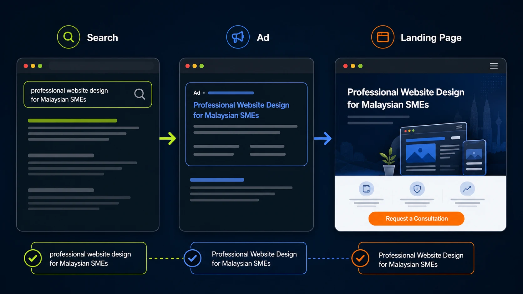
A strong chain looks like:
- Search intent → Advertisement → Landing page headline → Offer → CTA
For example:
Keyword:
- website design company Malaysia
Ad:
- Custom Website Design for Malaysian SMEs
Landing page:
- Professional Website Design for Malaysian SMEs That Need More Enquiries
CTA:
- Request a Website Consultation
Each step continues the same conversation.
3. Make the Headline Immediately Understandable
The headline should answer at least one of these questions:
What do I get?
Who is this for?
What problem does it solve?
Clarity usually matters more than cleverness.
Weak:
- Building Tomorrow's Digital Success Today
Better:
- Generate More Qualified Leads With Google Ads Managed for Malaysian SMEs
The second headline is not poetic.
It is useful.
The visitor knows:
- what the service is
- what outcome it aims for
- who it is intended for
Supporting copy can then explain the details.
Do not force the headline to contain every possible selling point.
Its job is to establish relevance quickly.
4. Put the Most Important Information Near the Top
The visitor should not need to scroll through several decorative sections before understanding the offer.
Google recommends placing important information prominently so customers can quickly find what they expected after clicking the advertisement.
The first screen should usually communicate:
- what you offer
- who it is for
- primary benefit
- CTA
- a useful trust signal
For example:
Google Ads Management for Malaysian SMEs
Generate qualified enquiries through professionally managed Search and Performance campaigns.
- [Request a Campaign Review]
Trusted by businesses across Malaysia.
That is enough to begin.
The rest of the page earns the conversion.
5. Explain the Benefit Before Listing Features
Businesses often write landing pages from the company's perspective.
They list:
- campaign management
- keyword research
- competitor analysis
- monthly reporting
- conversion tracking
Those are useful.
But the customer is asking:
What changes for me?
Translate capabilities into outcomes.
Instead of:
Conversion tracking setup
Try:
Know which campaigns and keywords are actually generating enquiries.
Instead of:
- Responsive website development
Try:
Give mobile visitors a faster and easier path to contact your business.
You still need to explain what is included.
Just make sure the visitor understands why it matters.
6. Use Enough Copy to Answer the Buying Question
There is no universal landing-page word count.
A simple emergency service may need relatively little explanation.
A high-value B2B solution may require:
- process
- integration details
- case studies
- security
- implementation
- FAQs
Unbounce analysed 41,000 landing pages, 464 million visitors and 57 million conversions in its 2024 Conversion Benchmark Report. It found a median landing-page conversion rate of 6.6% across all industries, but also showed large differences between industries and page types.
That benchmark should not become a universal target.
For example, Unbounce found a 3.8% median for SaaS landing pages and 6.1% for commercial and professional services, demonstrating how much the buying journey affects conversion performance.
The same applies to copy length.
Do not shorten a page merely because somebody says users do not read.
Remove copy that does not help the decision.
Keep information that answers genuine objections.
7. Make the CTA Specific
Avoid vague CTAs when a clearer one is available.
Examples:
- Submit
can become:
- Request My Quote
- Contact Us
can become:
- Book a Consultation
- Learn More
can become:
- See How the Service Works
Specific CTAs reduce uncertainty about what happens next.
The button does not need to make unrealistic promises.
The objective is simply to explain the action.
You can repeat the primary CTA after important sections.
For example:
- hero
- benefits
- case study
- process
- FAQ
The visitor should not need to scroll back to the top after deciding to act.
8. Do Not Automatically Make Every Form as Short as Possible
"Shorter forms always convert better" is incomplete advice.
Reducing unnecessary fields can reduce friction.
But some friction can improve lead quality.
Unbounce recommends using only the fields genuinely needed to support the sales process rather than blindly reducing every form to email alone.
Imagine two forms.
- Form A
- Name
- Phone
Generates 100 leads.
Only 10 are relevant.
- Form B
- Name
- Phone
- Company
- Service required
- Approximate project requirement
Generates 55 leads.
Thirty-five are relevant.
Form B technically has the lower form conversion rate.
Commercially, it may be much better.
The correct number of fields depends on:
- lead value
- sales process
- traffic source
- purchase complexity
- qualification requirements
Ask for what sales genuinely needs.
Remove what it does not.
9. Consider Multi-Step Forms for Complex Enquiries
Sometimes qualification requires several questions.
Displaying twelve fields at once can look intimidating.
A multi-step form can break that process into smaller decisions.
For example:
- Step 1
What service do you need?
- Step 2
What is your approximate requirement?
- Step 3
When do you want to begin?
- Step 4
Name and contact details.
Unbounce recommends multi-step approaches where substantial information is required, particularly when easier questions can be asked before more sensitive ones.
The important principle is progressive commitment.
Do not ask someone for unnecessary sensitive information before they understand why you need it.
10. Use the Right Level of Friction for the Traffic Source
A Google Search visitor and a Meta visitor may arrive with different levels of intent.
Someone searching:
- corporate lawyer Kuala Lumpur
already knows what they need.
Someone who sees a Meta advertisement may simply find the offer interesting.
That changes the landing experience.
Meta supports both instant lead forms and website forms, and explicitly notes that website forms can be appropriate when prospects need to view more information, generate a quote, book an appointment or evaluate a higher-consideration product before enquiring.
A recent r/PPC discussion illustrates the trade-off. One advertiser reported receiving 130 Meta leads but very poor follow-up quality. Some practitioners recommended introducing more friction with a website landing page, while another participant noted that instant forms performed better in a different high-value campaign.
That is exactly the point.
There is no universal winner.
Test:
- instant form
- against
- landing page
using qualified lead quality, not form volume alone.
11. Show Proof Close to the Decision
Visitors need a reason to believe you.
Useful trust elements can include:
- testimonials
- client logos
- case studies
- reviews
- certifications
- relevant numbers
- industry experience
- before-and-after examples
- portfolio
- team credentials
Use evidence you can genuinely support.
Weak:
We are the leading agency in Malaysia.
Better:
See how we reduced cost per qualified enquiry for a Malaysian B2B campaign.
Then show the evidence.
Google itself recommends providing useful original content and notes that authentic customer reviews can help visitors evaluate the offer.
Do not place every award the business has ever received in the hero.
Choose proof relevant to the current decision.
12. Use Case Studies to Reduce Perceived Risk
Case studies are particularly useful for expensive or complex services.
A prospect wants to know:
Have you solved something like this before?
Keep case studies concise on the landing page.
A useful structure is:
- Client situation
What was happening?
- Problem
What needed to improve?
- Approach
What did you change?
- Result
What changed?
For example:
A Malaysian service business was generating enquiries through paid search, but many were irrelevant. Campaign restructuring, tighter search-term control and a new service-specific landing page improved the proportion of qualified enquiries.
Then link to the complete case study if appropriate.
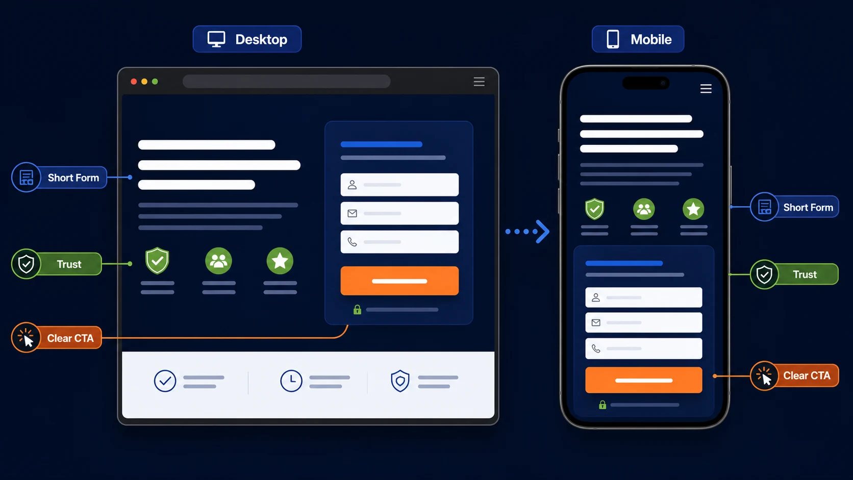
13. Make Mobile Conversion the Default, Not an Afterthought
A page designed beautifully at 1440 pixels can still be frustrating on a phone.
This matters in Malaysia, where DataReportal reported 44 million cellular connections at the end of 2025 and 99.3% broadband capability among those connections.
Google also specifically recommends fast, easy-to-contact, simple mobile landing pages for paid campaigns.
Test the real page on a phone.
Check:
- headline wrapping
- button size
- sticky CTA
- form inputs
- dropdowns
- autofill
- WhatsApp button
- phone links
- pop-ups
- chat widget
- cookie notice
- keyboard behaviour
- thank-you page
Do not only shrink the desktop layout.
Design the mobile decision path intentionally.
14. Make WhatsApp Useful Without Letting It Hijack the Page
For many Malaysian businesses, WhatsApp is a natural enquiry channel.
That can be useful.
But there are two common mistakes.
Mistake 1: WhatsApp Is Hidden
The customer prefers messaging but cannot find an obvious way to start the conversation.
- Mistake 2: WhatsApp Is Everywhere
A floating button covers form fields.
Another WhatsApp CTA sits in the hero.
Another appears in the navigation.
A chat pop-up opens automatically.
Now the page becomes noisy.
Choose an appropriate role.
If WhatsApp is the primary conversion:
- WhatsApp Us for a Quote
can be the main CTA.
If the form is more important:
- Request a Consultation
can remain primary while WhatsApp becomes a secondary option.
Messaging works best when the next step is clear.
Meta's current messaging lead guidance similarly recommends continuing the message from the advertisement, beginning with simple qualifying questions and clearly telling the prospect what happens next.
15. Explain What Happens After the Form
Uncertainty creates friction.
Visitors may wonder:
Will someone call immediately?
Will I receive spam?
Do I need to prepare anything?
Is this a sales call?
How soon will someone reply?
You can reduce that uncertainty.
For example:
Submit the form and our team will review your requirements and contact you to arrange a short consultation.
Or:
Tell us what you need. We will review the request and reply through WhatsApp or phone during business hours.
Do not promise an unrealistic response time.
Just explain the process.
16. Remove Navigation When It Creates Unnecessary Escape Routes
Not every landing page needs the full website navigation.
If the visitor arrived from a tightly targeted paid campaign, a large menu can introduce competing paths:
- About
- Careers
- Blog
- Other services
- Partners
That does not mean landing pages must always contain no navigation.
The decision depends on:
- traffic source
- trust requirements
- complexity
- user intent
Google recommends keeping landing-page navigation easy and avoiding unnecessary distractions.
For high-intent paid campaigns, simplifying navigation can often make sense.
For higher-consideration B2B offers, access to About, case studies or company information may help establish trust.
Test according to the customer journey.
17. Do Not Hide Essential Information Behind the Form
A visitor should not have to submit personal information to discover basic information such as:
- what the service does
- whether you serve their location
- who the service is for
- what happens next
The page should earn the enquiry.
Gating useful content can make sense for lead magnets.
Gating basic service clarity usually does not.
18. Improve Page Speed Without Turning It Into a Score Competition
Landing pages often receive paid traffic.
Slow performance therefore wastes attention you already paid to acquire.
Google recommends regularly evaluating campaign landing pages and specifically identifies mobile speed as an important part of the post-click experience.
Common problems include
- oversized hero images
- unnecessary animations
- video autoplay
- third-party scripts
- multiple tracking tools
- large fonts
- chat widgets
- poorly optimised images
Kaina's website design and development services can support landing-page development when conversion problems require changes to performance, layout, forms or the underlying website.
Do not chase a perfect technical score while ignoring a confusing offer.
Performance should support conversion.
19. Build Tracking Before Launching Traffic
Do not wait until the campaign has spent money to discover that the form was never tracked.
Configure the primary conversions before launch.
Depending on the campaign, that may include:
- form submitted
- call
- WhatsApp conversation
- consultation booked
- quote request
- qualified lead
For Google Ads, landing-page performance and conversion data should be reviewed alongside campaign performance rather than treating the click as the final outcome.
For lead-generation campaigns using Meta, CRM connections can also send downstream lead quality information back to the platform. Meta states that its Conversions API can be used with CRM outcomes so campaigns can learn which leads become more valuable opportunities.
The measurement journey should increasingly resemble:
- Visitor → Lead → Qualified Lead → Customer
not:
- Visitor → Button Click
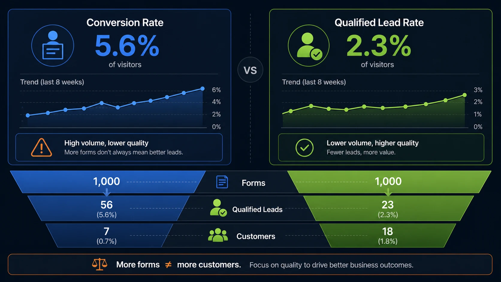
20. Judge Lead Quality, Not Only Landing Page Conversion Rate
Suppose Page A converts at 10%.
Page B converts at 6%.
Which page is better?
You cannot answer yet.
If Page A generates:
- 100 leads
- 10 qualified
and Page B generates:
- 60 leads
- 35 qualified
Page B may be the stronger commercial page.
Unbounce's own benchmark research warns that landing-page conversion benchmarks measure conversion events, not the value of those conversions.
That distinction is essential for:
- professional services
- B2B
- property
- high-value consulting
- healthcare
- education
A landing page should not maximise submissions at any cost.
It should generate enough of the right submissions.
21. Use Benchmarks Carefully
Unbounce's large dataset produced a 6.6% median conversion rate across industries.
Do not turn that into:
Every Malaysian landing page should convert at 6.6%.
The benchmark combines:
- different industries
- different traffic sources
- different offers
- different conversion actions
- different purchase values
Professional services in the same dataset had a 6.1% median, while SaaS had 3.8%.
Benchmarks are useful for context.
Your strongest benchmark is still:
Can this page improve relative to its existing performance while preserving or improving lead quality?
22. Test Hypotheses, Not Random Design Preferences
Do not A/B test something simply because two people in a meeting disagree.
Start with evidence.
For example:
Observation
Visitors reach the form but few complete it.
- Evidence
Session recordings show repeated abandonment around the budget field.
Hypothesis
The budget ranges are too restrictive or unclear.
Test
Rewrite the question or adjust the ranges.
- Metric
Qualified form submissions.
That is a meaningful CRO test.
Changing a button from orange to blue because "blue feels more trustworthy" is not a strong starting hypothesis.
23. Test the Offer Before Obsessing Over the Design
Sometimes the page is fine.
The offer is weak.
Compare:
- Contact us for more information
with:
- Request a Free 20-Minute Website Performance Review
The second gives the visitor a clearer reason to act.
Possible lead-generation offers include:
- consultation
- assessment
- audit
- quotation
- demo
- calculator
- strategy call
- eligibility check
The offer should match the customer's level of intent.
Do not force a cold visitor into:
- Talk to Sales Now
when:
- See Whether This Solution Fits Your Business
would be a more realistic next step.
24. Connect the Landing Page to the Right Traffic Strategy
A landing page cannot compensate indefinitely for poor traffic.
For high-intent search demand, Kaina's Google and Meta Ads services can connect Google Search campaigns with dedicated landing pages built around the same keywords and offers.
For organic acquisition, SEO services in Malaysia can bring commercially relevant searchers into suitable service and campaign pages.
For businesses that need to create demand before customers search, social media marketing and influencer marketing may introduce the offer earlier in the journey.
Each source can produce visitors with a different level of awareness.
The landing page should reflect that.
A Google Search visitor may need less education.
A social visitor may need more explanation and proof.
25. Protect the Personal Data You Collect
Lead-generation pages collect personal data.
That means form design is also a data-protection decision.
Malaysia's Personal Data Protection framework applies to personal data processed in connection with commercial transactions. The Personal Data Protection Department also states that organisations processing such data should provide relevant notice about how personal information is processed.
The Department lists rights including being informed about the purpose of processing and preventing processing for direct-marketing purposes.
Practically, businesses should review
- what information the form collects
- why each field is necessary
- privacy notice
- consent where applicable
- CRM access
- storage
- third-party integrations
Do not ask for sensitive or unnecessary information merely because more data would be convenient for marketing.
For specific compliance questions, obtain appropriate legal or data-protection advice.
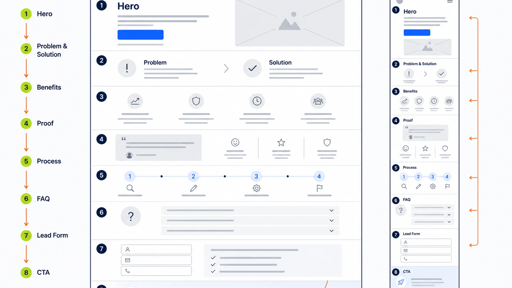
Landing Page Structure for Lead Generation
A practical structure could look like this:
Section 1: Hero
Include
- clear headline
- supporting proposition
- main CTA
- strong trust signal
Section 2: Problem
Show that you understand what the customer is trying to solve.
Section 3: Solution
Explain how the service addresses that problem.
Section 4: Benefits
Translate capabilities into business outcomes.
Section 5: Proof
Use
- clients
- testimonials
- results
- case studies
Section 6: Process
Explain what happens after the enquiry.
Section 7: Offer
Reinforce what the visitor gets.
Section 8: Form
Ask only what is useful.
Section 9: FAQ
Resolve final objections.
Section 10: CTA
Give the visitor one more clear path to act.
The exact order can change.
The principle is to move from:
- relevance → understanding → trust → action
Landing Page Checklist
Before launching a campaign, review
Page has one primary objective
- Headline matches the campaign intent
- Advertisement and landing page use consistent messaging
- Offer is clear immediately
- Primary CTA appears near the top
- CTA explains the next step
Benefits are clearer than feature lists
- Important objections are answered
- Relevant proof is included
- Testimonials are genuine
- Form contains only useful fields
- Qualification questions serve a real purpose
- Mobile form works properly
- WhatsApp does not obstruct the page
Page loads reliably on mobile
Navigation does not create unnecessary distraction
Conversion tracking is tested
- Thank-you action works
- CRM receives leads correctly
- Sales team knows where leads arrive
- Privacy information is available
Page is reviewed after campaign data arrives
Kaina Digital can Create Your Next Landing Page
Landing-page performance sits between advertising, design, development and conversion optimisation.
That makes it difficult to solve when those responsibilities are completely disconnected.
Kaina's website design and development capability can support campaign pages where the main issue is:
- UX
- mobile layout
- page speed
- forms
- messaging hierarchy
- tracking implementation
Its Google and Meta Ads capability can address what happens before the click:
- keywords
- audiences
- ad messaging
- campaign intent
And its SEO services can help ensure organic searchers reach pages that match their intent.
For businesses working across multiple channels, Kaina's broader digital marketing services can connect the traffic source with the page and eventual lead outcome.
The important part is diagnosing where the actual problem sits.
Sometimes the advertisement is wrong.
Sometimes the audience is wrong.
Sometimes the offer is weak.
Sometimes the page is confusing.
Sometimes the page generates plenty of leads, but they are the wrong leads.
A good lead-generation landing page is not simply the page with the highest form conversion rate.
It is the page that helps turn the right visitors into worthwhile sales opportunities.